Button blocks are not semantically buttons, but links inside a styled div. If you do not add a link, a link tag without an anchor…
Continue Reading....Block: Cover
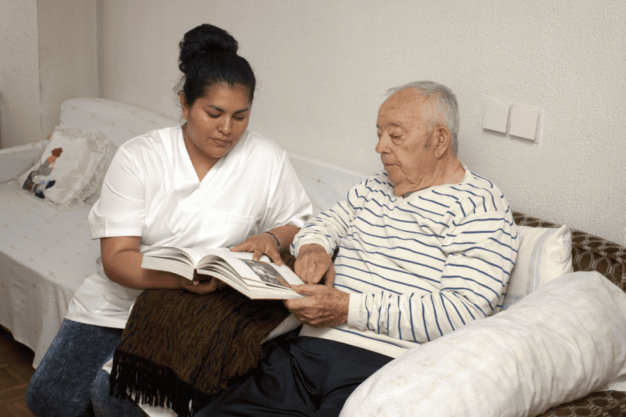
The cover block lets you add text on top of images or videos. This blocktype has several alignment options, and you can also align or…
Continue Reading....Block: Gallery
Gallery blocks have two settings: the number of columns, and whether or not images should be cropped. The default number of columns is three, and…
Continue Reading....Block: Columns

This page tests how the theme displays the columns block. The first block tests a two column block with paragraphs. This is the second column.…
Continue Reading....Block: Quote

The quote block has two styles, regular: Gutenberg is more than an editor. The Gutenberg Team and large: Yes, it is a press, certainly, but a…
Continue Reading....Block category: Common

The Common category includes the following blocks: Paragraph, image, headings, list, gallery, quote, audio, cover, video. The paragraph block is the default block type. It…
Continue Reading....Block category: Widgets

The shortcode widget: The Archive Widget: The same Archive widget but as a dropdown: The Category widget block has an additional option for showing category…
Continue Reading....Block category: Layout Elements

The Layout Elements category includes the following blocks: Group, Button, Columns, Media & Text, separator, spacer, read more, and page break. This group block has…
Continue Reading....